Explainer: env(preferred-text-scale)
Last Modified May 22, 2025
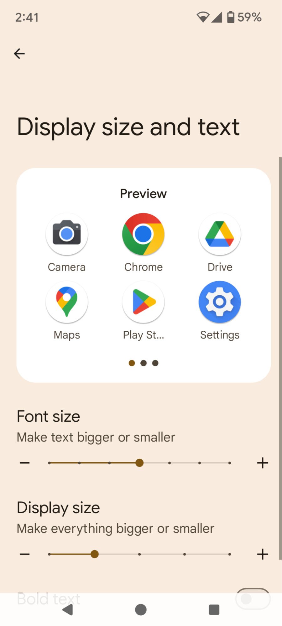
Existing user controls to scale content
Firefox on Android – global zoom slider labelled as “Font Size”
Chrome on Android – per-site zoom slider
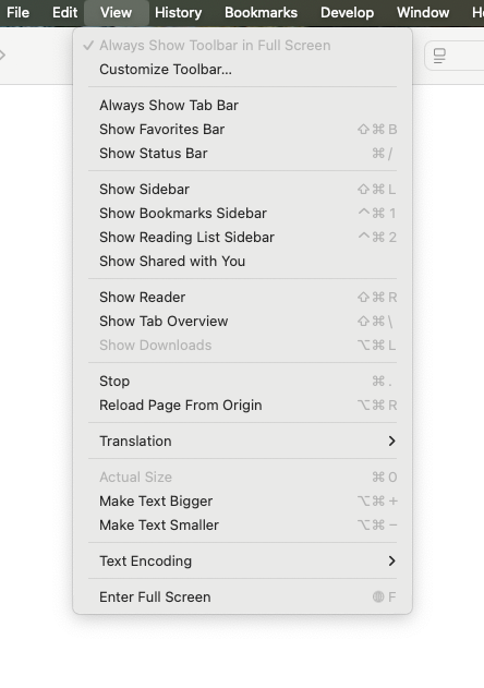
Safari/iOS – per-site zoom buttons
Authors can induce browser zoom
How authors detect and respond to browser zoom
How authors detect and respond to visual zoom
Chrome and Edge on desktop OSs
How authors detect and respond to UA-level font setting
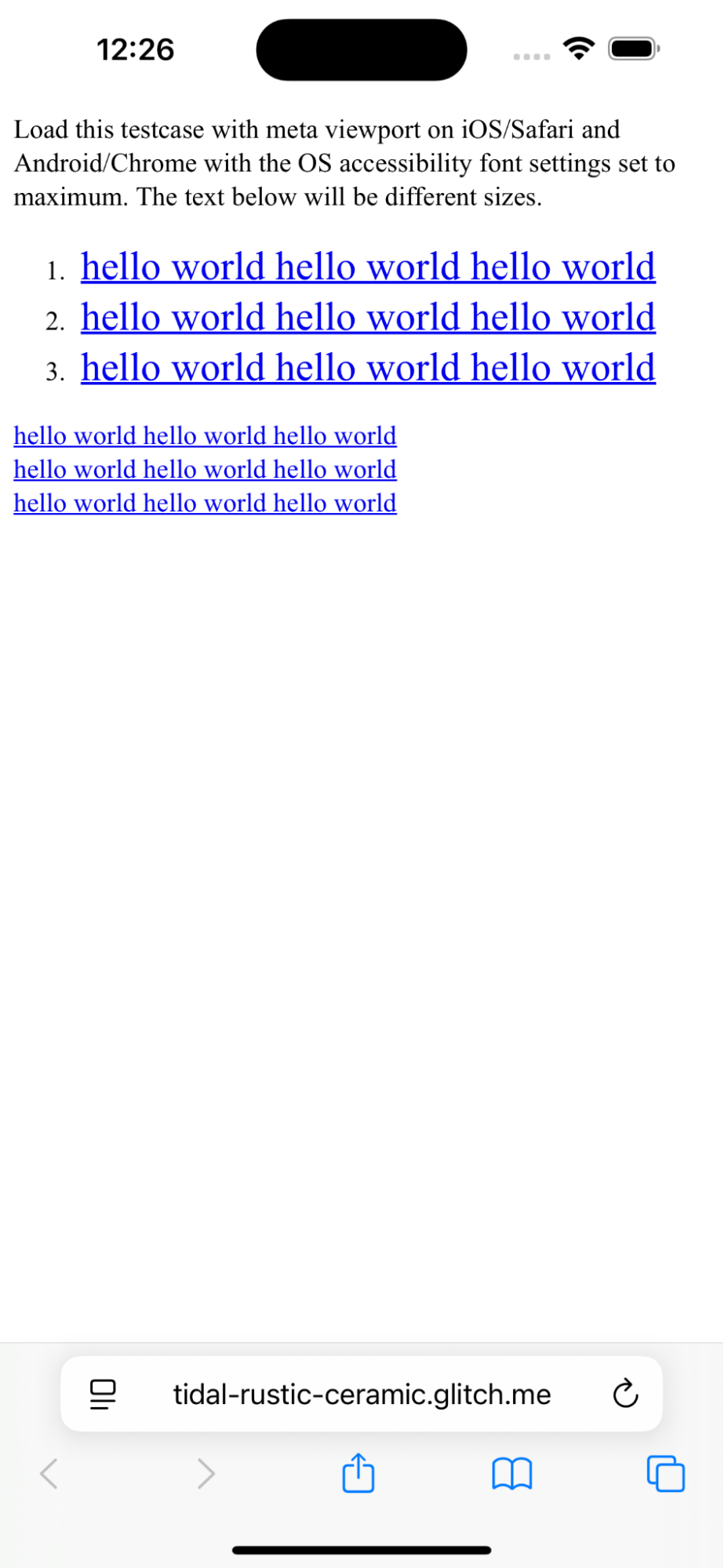
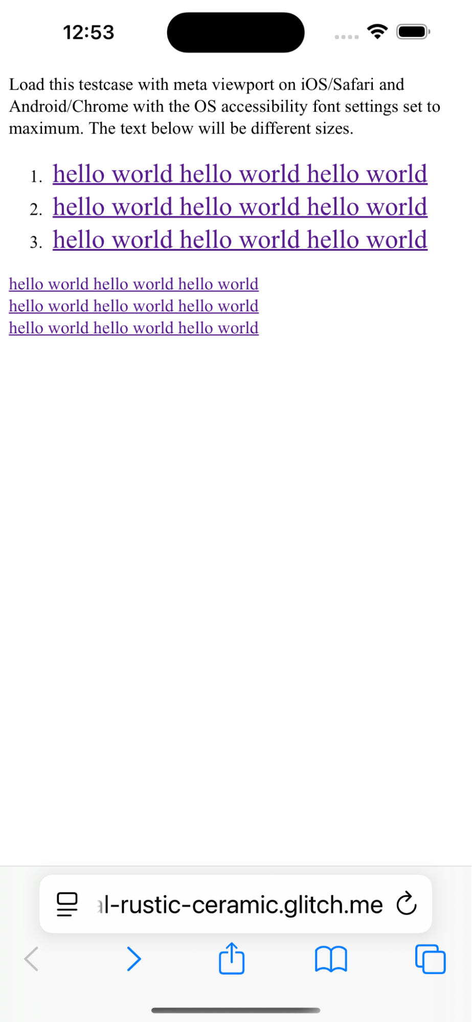
Safari on iOS – no effect on sites
Chrome on Android – usually no effect
How authors detect and respond to OS-level font setting
How authors will use env(preferred-text-scale)
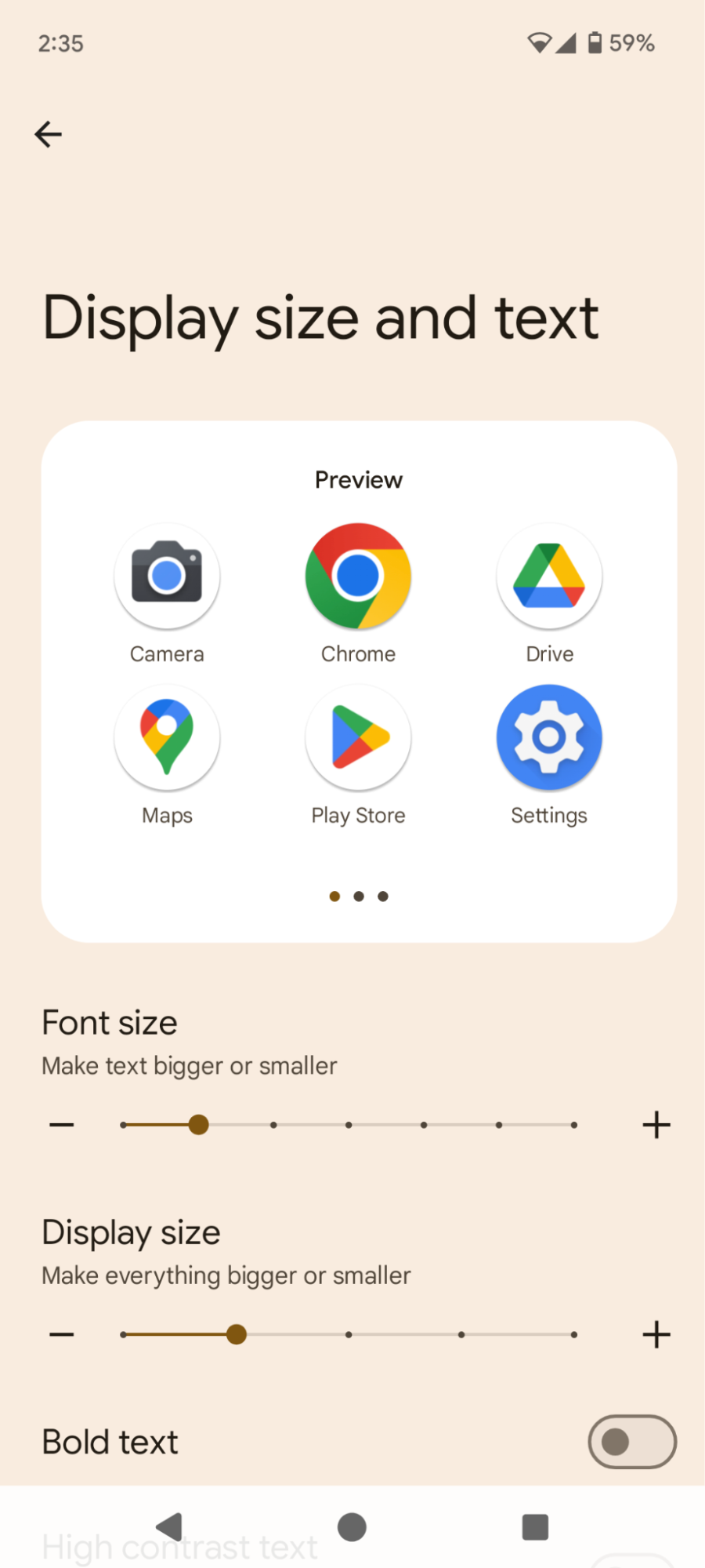
Explicitly adjusting the text size
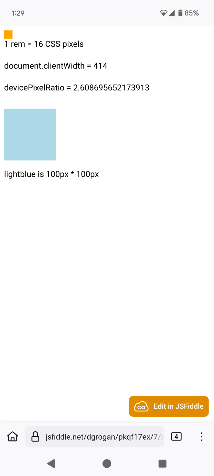
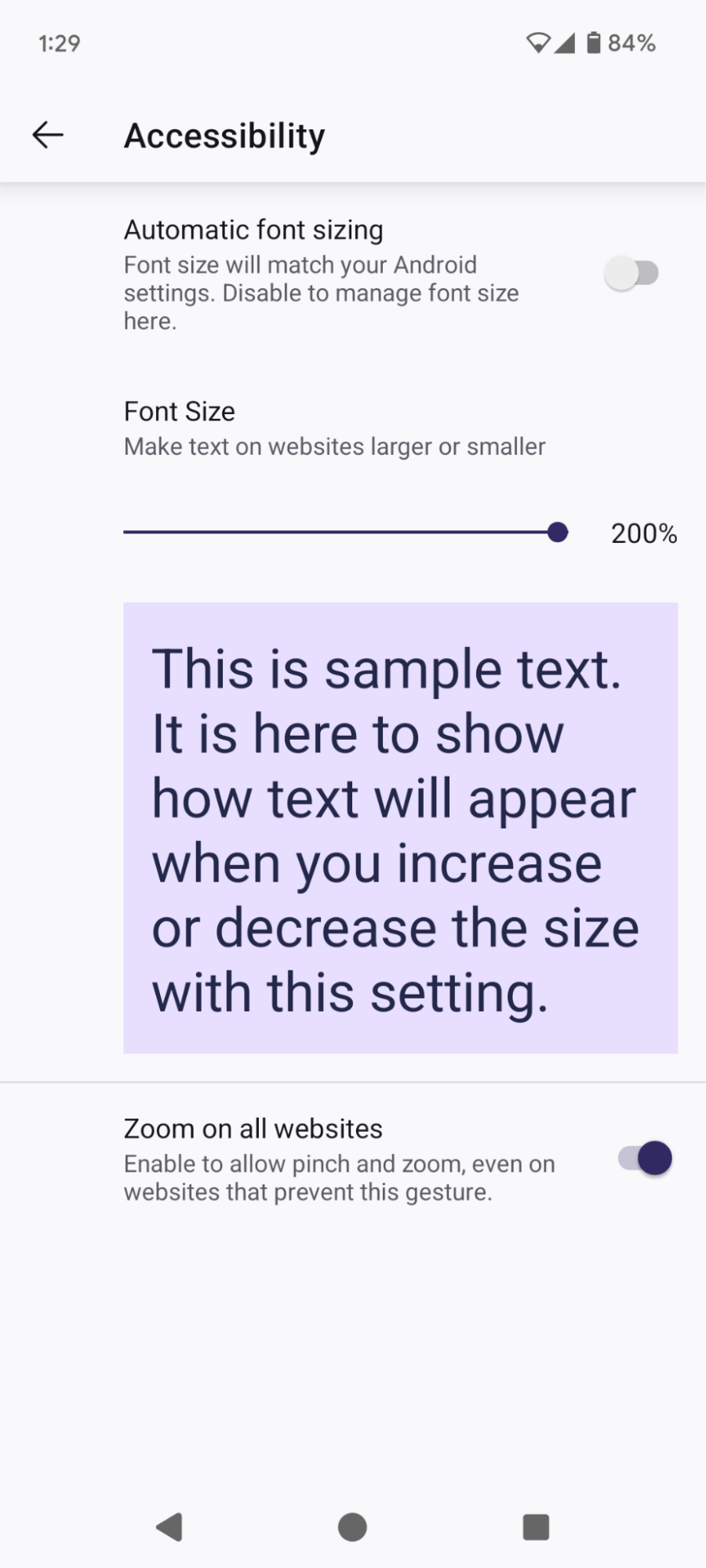
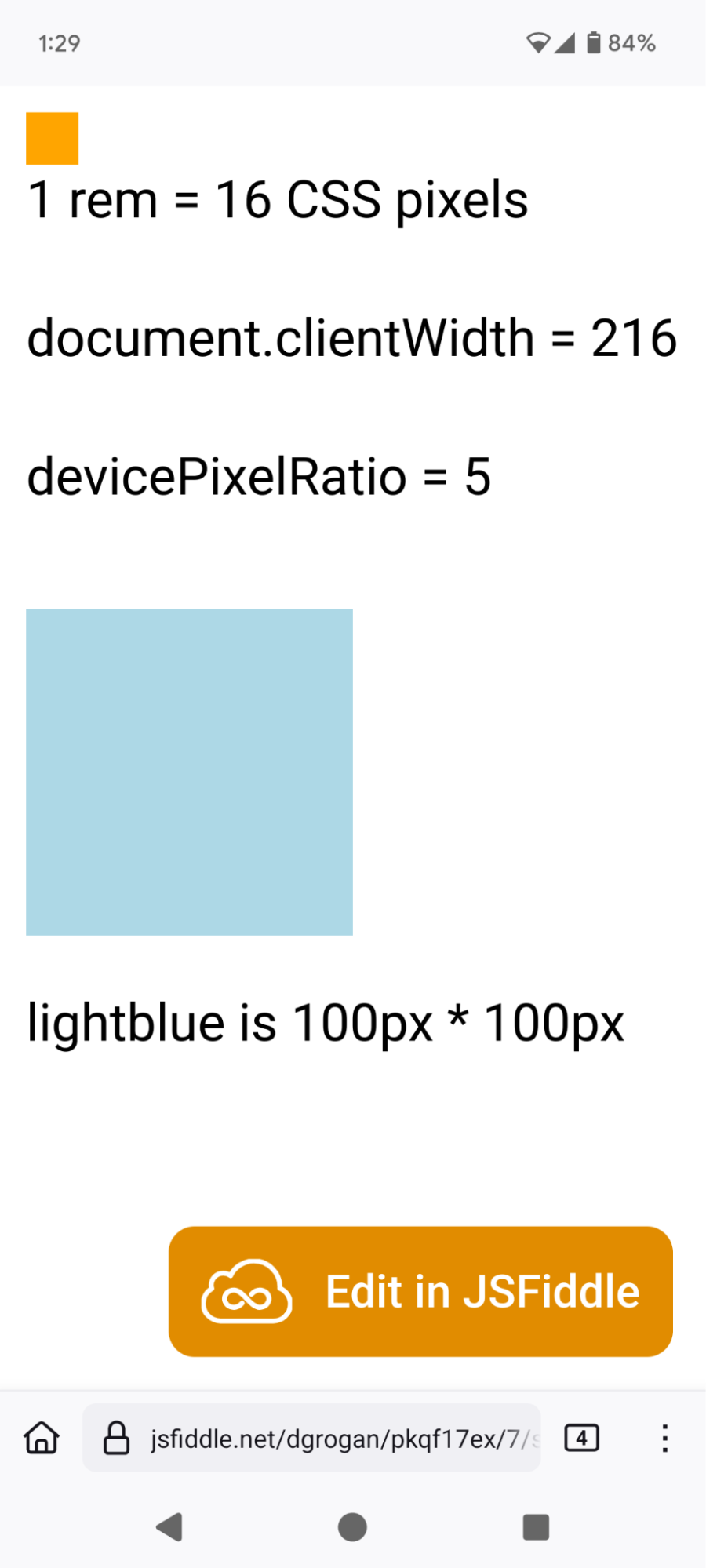
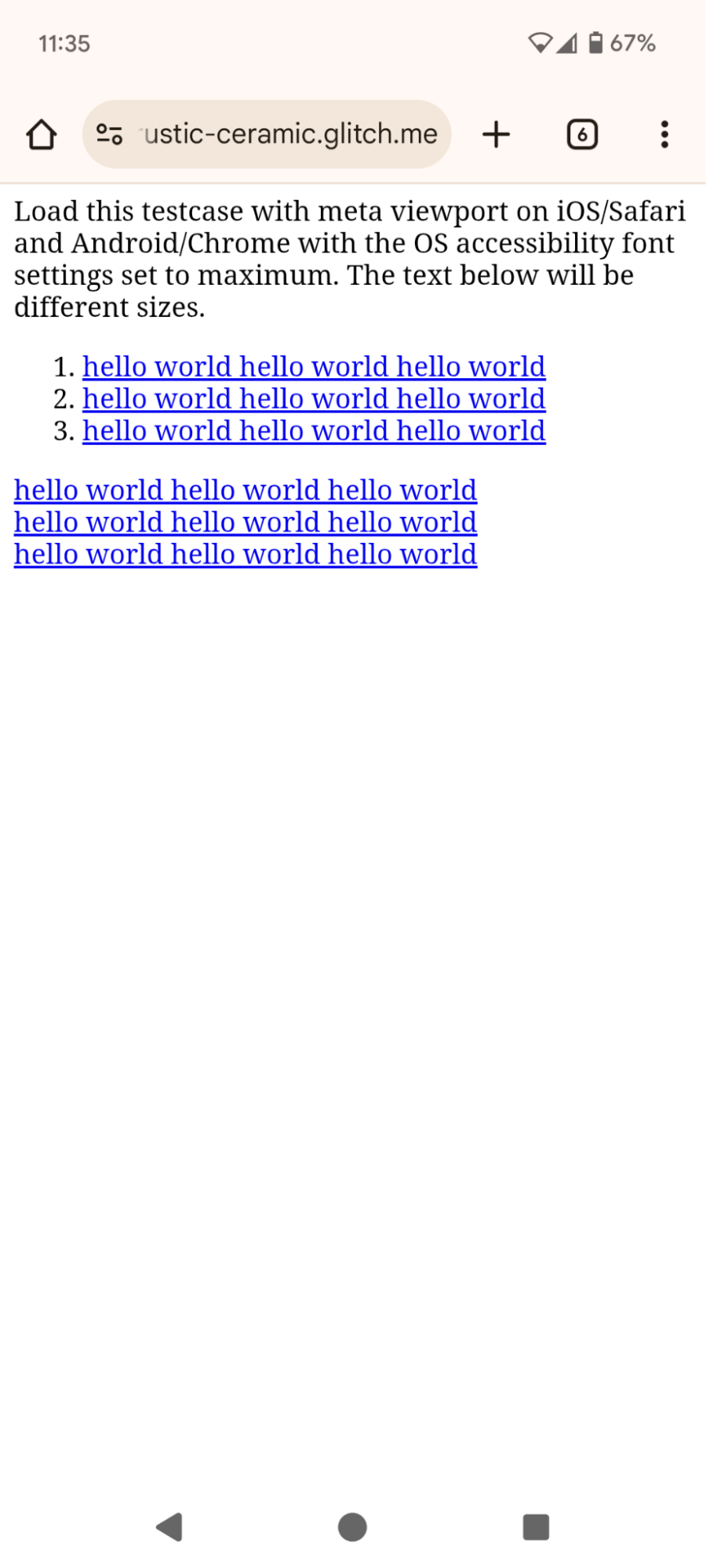
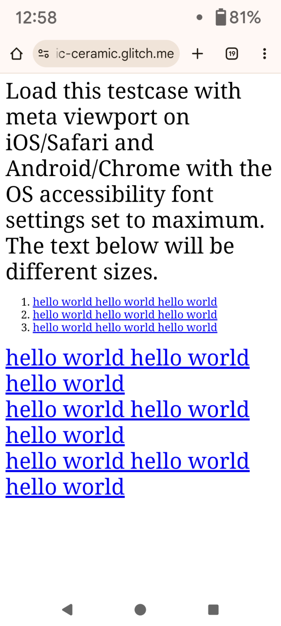
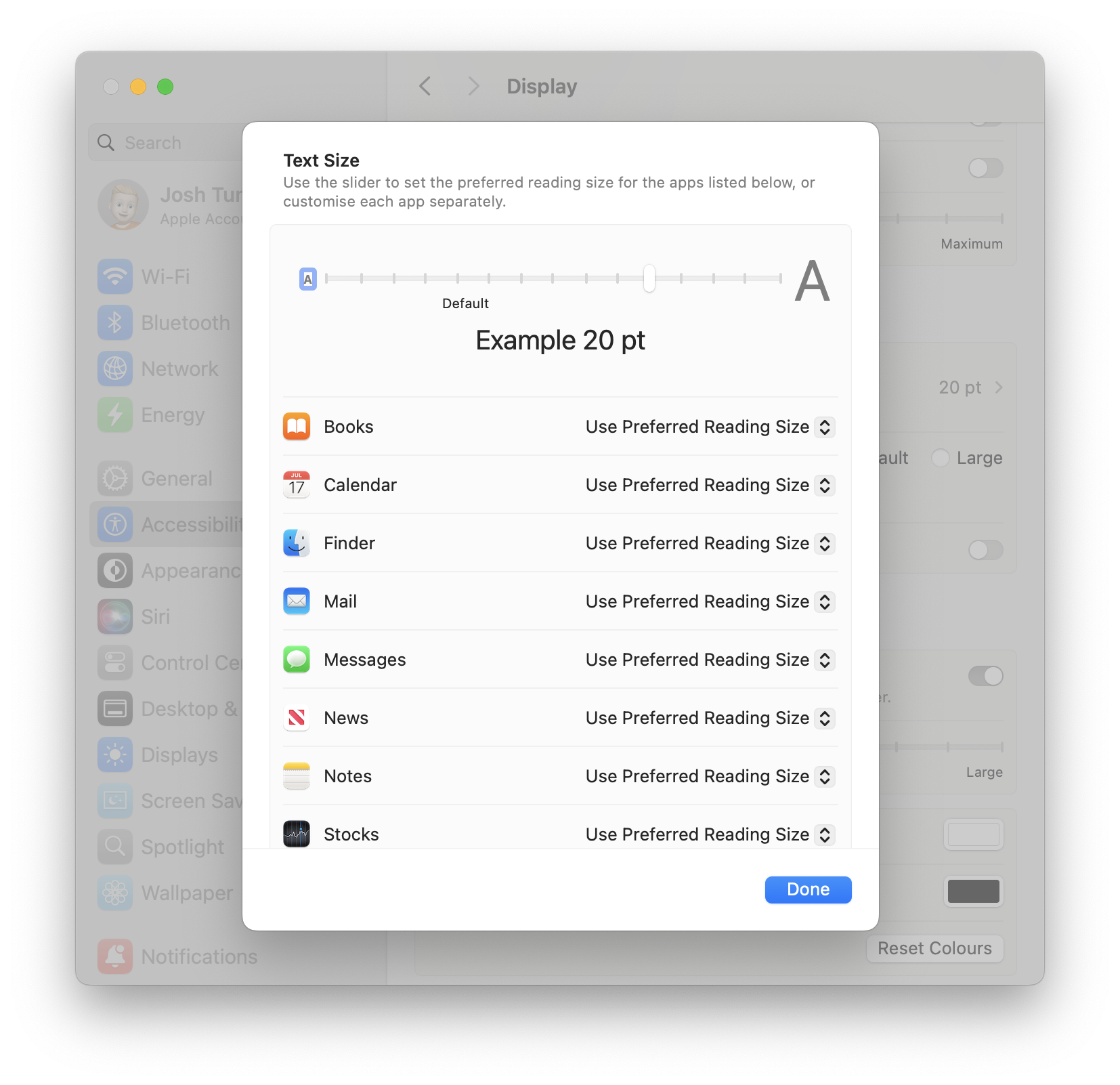
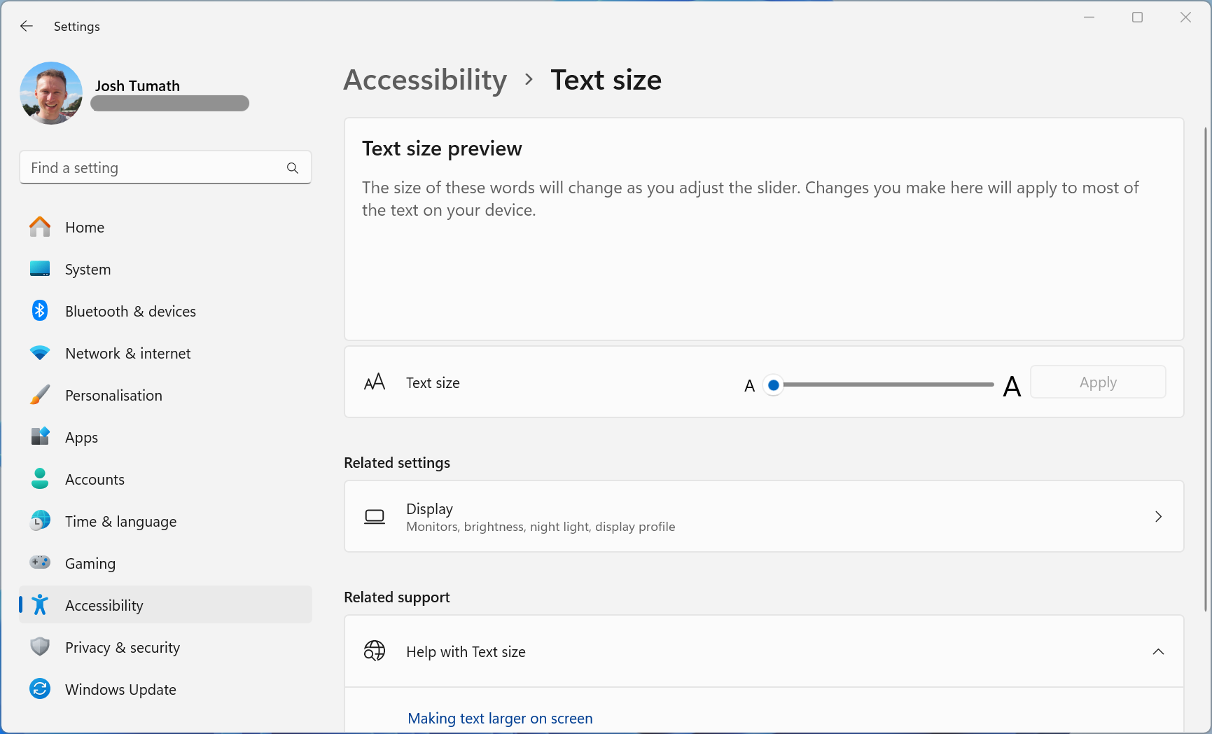
How do I test this text scaling?
What about the minimum font size a user has selected?
New meta viewport key for changing text-scale
Fold OS-level font scale into initial font size
Operating systems and web browsers provide global accessibility settings for the user to increase their system text scale.[1] Authors would like to respect the user’s text scale settings.
However, when the user increases the text scale, website text either doesn’t scale or the browser will do a full page zoom (where everything – not just text – scales). The web platform has no standardised native way to respect the user’s text scale setting and adjust the layout accordingly to fit the scaled text.
Both authors and users have lamented this lack of support, especially on mobile, where Ctrl +/- isn’t as convenient, where pages can be embedded in app Web Views and where screen space is at a higher premium.
We propose to provide authors with access to the user’s system font scale factor via a new CSS environment variable: env(preferred-text-scale).
Research has shown that around 37% of Android users and 34% of iOS users have changed their system-level font scale factor from the default.[2]
However, browsers can’t simply apply the user’s system-level font scale to all web pages, because – if they did – many existing page layouts would break, causing content to be invisible or to lose interactivity.
Mobile browsers use certain heuristics to control when to automatically inflate text size – particularly on web pages that don’t use the <meta viewport> tag. The text auto-sizing can be controlled using the text-size-adjust property and can be disabled by setting it to none. Text auto-sizing does not happen on desktop browsers.
reddit today with Blink’s text autosizing. Notice the heuristics non-uniformly scale comment font size.
Browsers provide the user various methods to scale the text or to zoom the entire content per-page or per-site. Browsers have generally moved away from text scaling (or ‘text zoom’) and instead do full zoom (or ‘browser zoom’), which expands every box on the page, regardless of whether they were sized with a font-relative unit (like em) or physical unit (like px).
BBC Sport live page with 200% full page zoom.
However, many of these methods aren’t available to the user when interacting with a Web View (where a browser frame is embedded in a native app).
BBC Sport live page on iOS rendered in an iOS WebView. The user has increased the OS text scale but it has had no effect on the embedded web content.
Past discussions about this space have revealed confusion over the different types of content scaling and how browsers support each of them. So in this section we survey the various controls users have and how authors can account for these preferences.
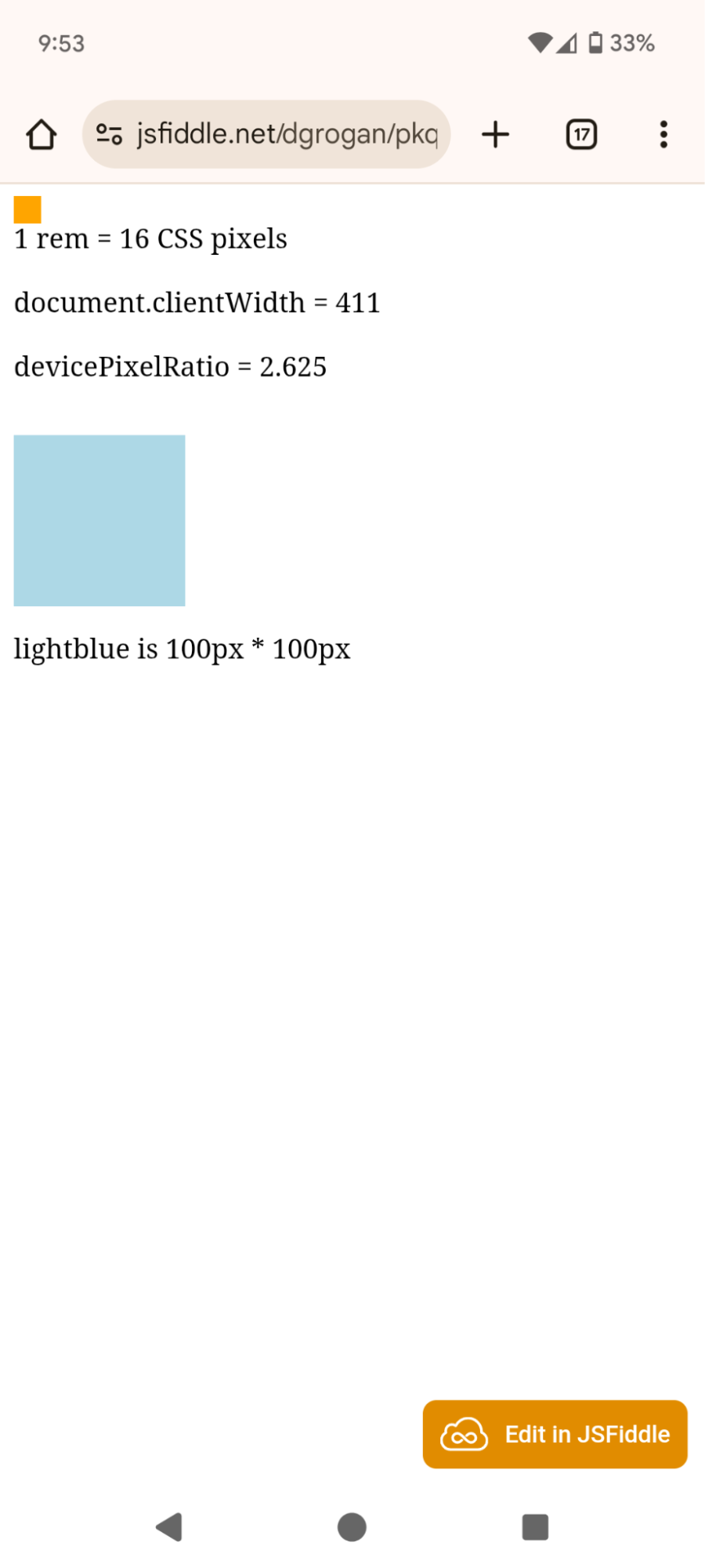
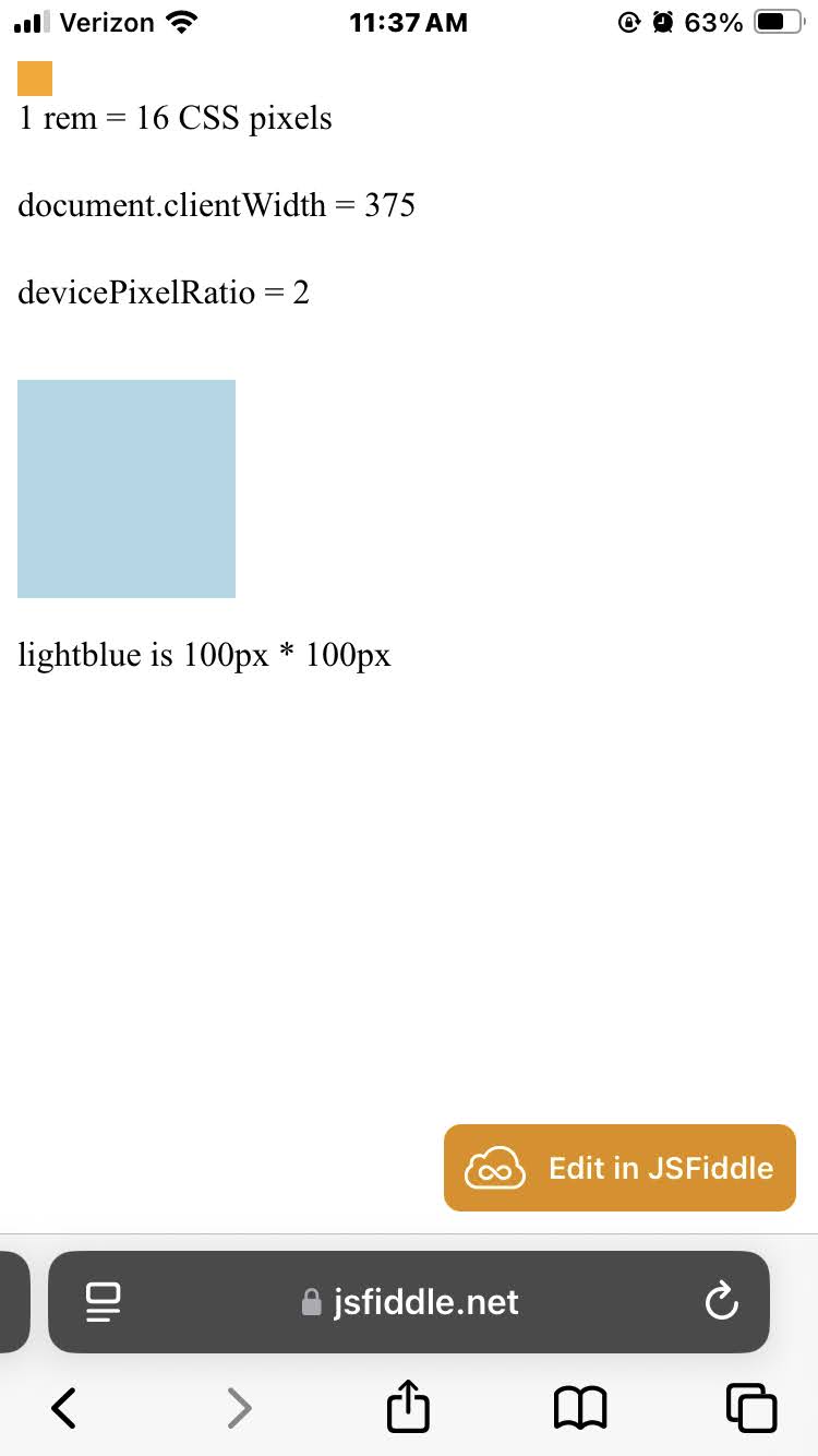
Browser zoom works the same on all browsers. (Ctrl/Cmd +/- on desktop, zoom slider on Chrome/Android, zoom control in the menu to the left of the url bar on Safari/iOS)
Characteristics of browser zoom / full zoom:
Browser zoom can cause content to overflow the inline viewport edge, meaning users have to do lawnmower swiping (swiping back and forth) to read the content of the page. Lawnmower swiping is a poor user experience.
Further, authors usually don’t want padding / spacing between elements to change by the same factor as text, but this happens with Browser zoom, leading to a subpar design.
|
100% |
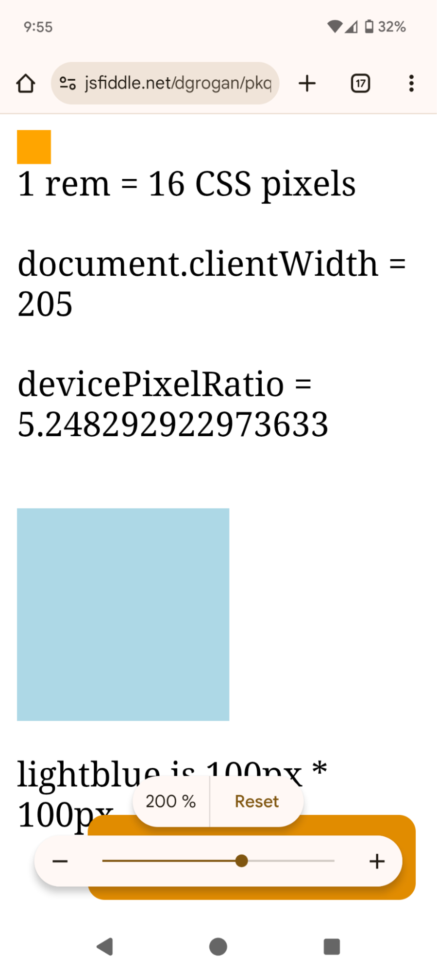
Change [mislabeled] slider from 100% to 200% |
200% |
|
|
|
|
|
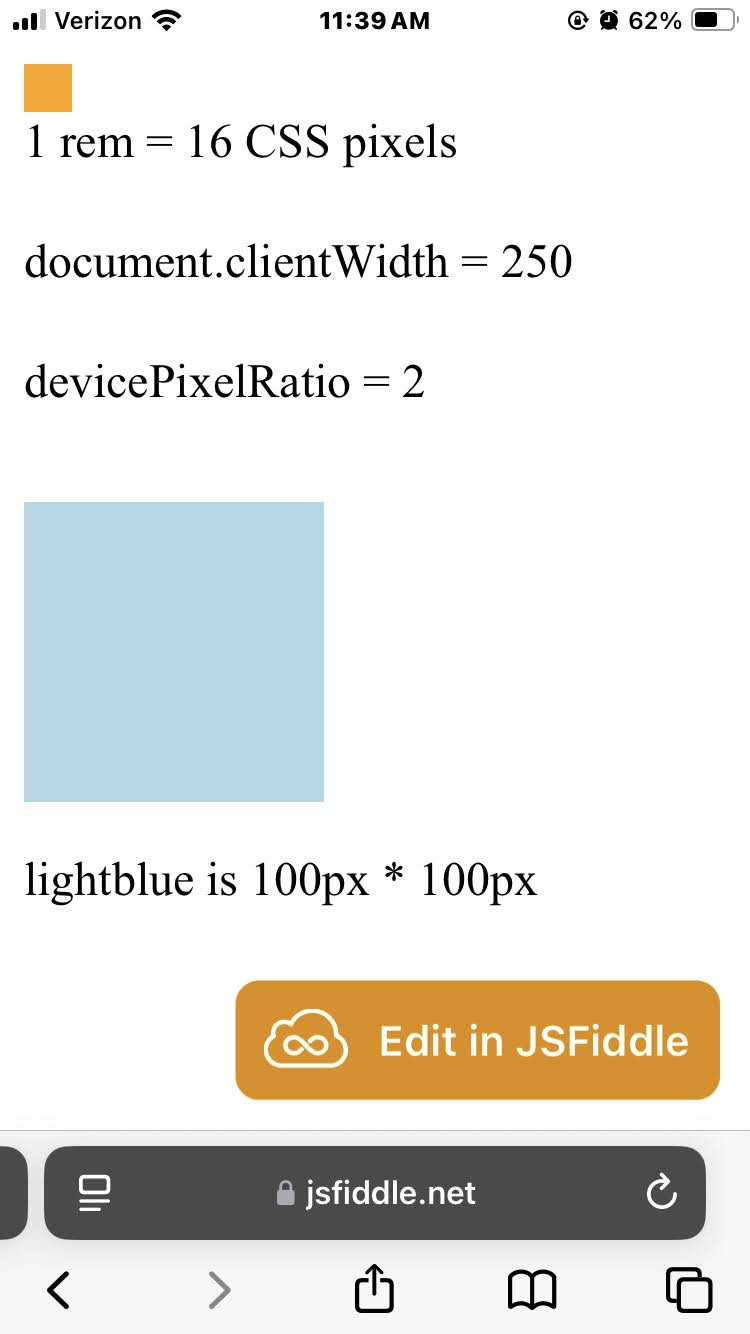
100% |
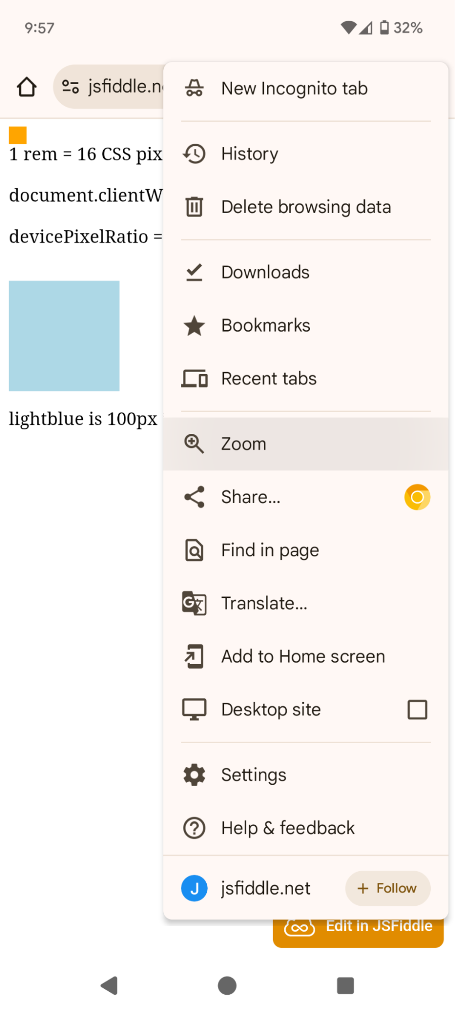
There are a few ways to open the zoom slider |
200% |
|
|
|
|
|
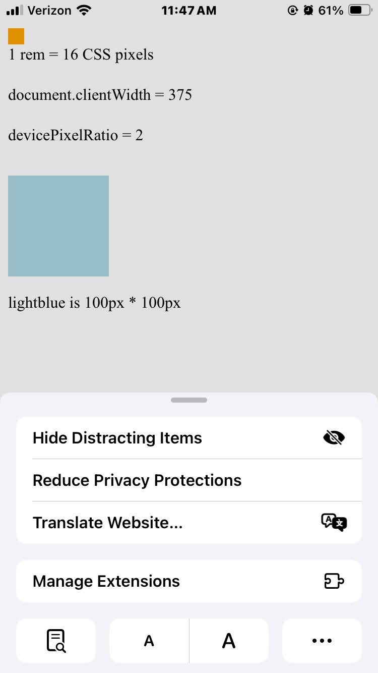
100% |
Hit the large ‘A’ 3 times to get a browser zoom of 150% |
150% |
|
|
|
|
|
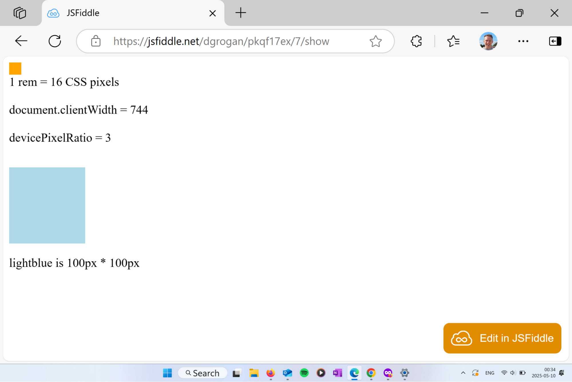
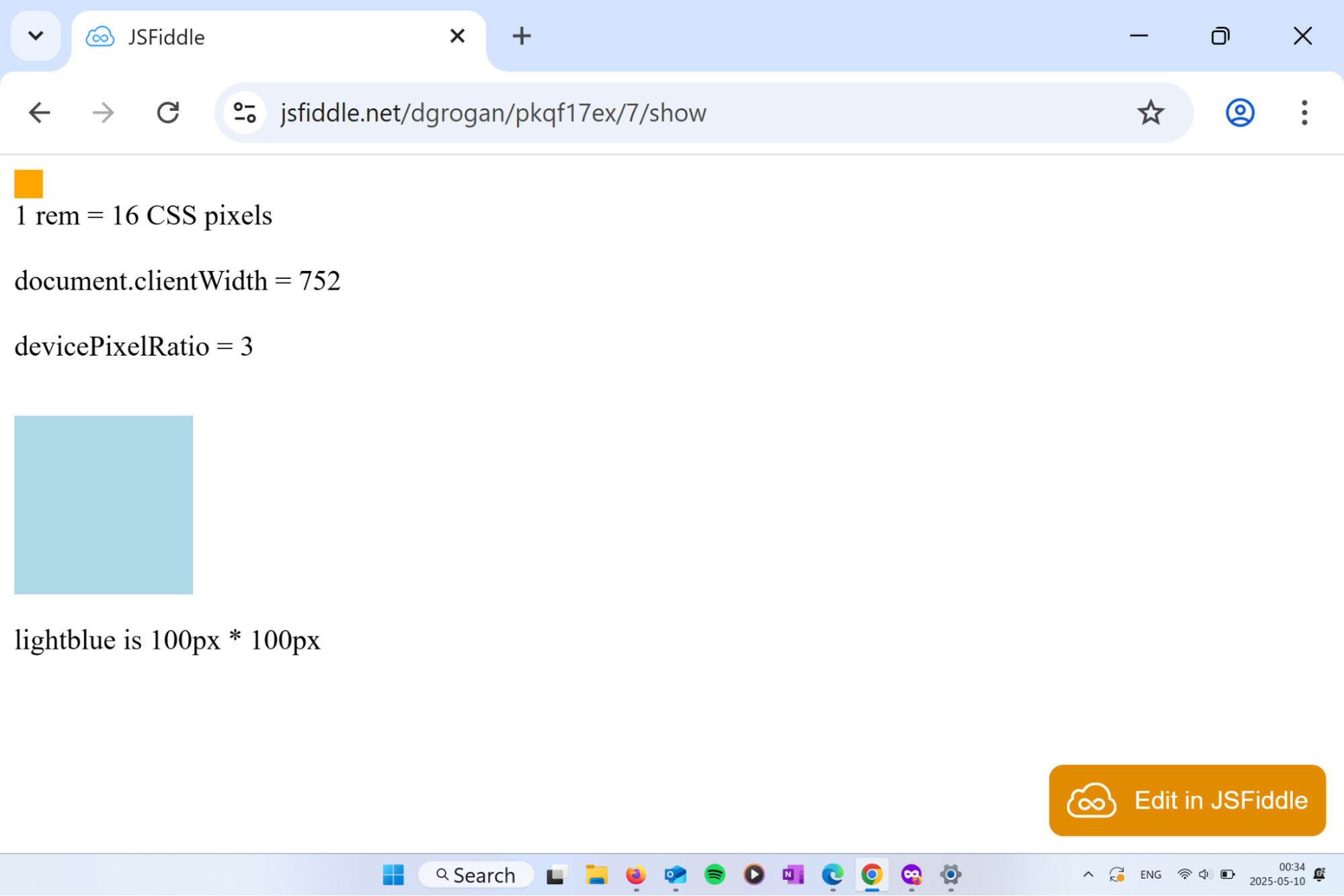
Note: devicePixelRatio did change in the image on the right, but Safari has a bug about changing the value exposed at `window.devicePixelRatio` |
Authors can use the CSS zoom property to zoom on any element, including the root element.
:root {
zoom: 3;
}
|
Note: The proposed env(preferred-text-scale) could be used with this property via zoom: env(preferred-text-scale), though we suspect there are not many appropriate applications for this usage. Perhaps full-screen games rendered in a canvas. |
Note that, unlike actual browser zoom, the zoom property – when applied to the root element – will not affect media queries.
Visual zoom – known to most people as pinch-to-zoom – only expands the visual rendering. It has no effect on the content.
Users on mobile frequently do visual zoom, specifically because sites can’t and don’t respond well to OS-level font preferences. These users have to do lawnmower swiping (swiping back and forth) to read the content of the page. Lawnmower swiping is more common with Visual zoom than with Browser zoom. As previously mentioned, lawnmower swiping is a poor user experience.
|
Note: Visual zoom is not affected by this proposal. |
Authors rarely need to respond to visual zoom.
UA-level font scale controls let the user override the initial font-size value medium (which is de facto 16px otherwise). Doing so adjusts the other absolute font size keywords as well.
Because the UA’s initial font-size gets changed, media queries that use font-relative units like em or rem are affected by the UA-level font setting.
|
Note: Unless the author overrides the root element’s font-size property, rem units are relative to the UA’s initial medium font-size. |
Also note that engines cannot simply delegate the UA-level font setting to the OS-level font setting (which would mean that the initial root font-size medium would be affected by the OS-level font setting). If they did, many websites’ layouts that aren’t designed to adapt to larger font sizes would break.This breakage stems from the fact that, empirically:
count(users) who change OS-level fonts >> count(users) who change UA-level fonts
Authors have tried to correctly use rem and em units to respond to UA-level font changes, but have not been very successful. (If you change your UA-level font setting and browse the web, especially in a mobile emulator, you’ll see that many pages are broken. We hypothesize that authors aren’t aware of this breakage because so few users are affected by it.)
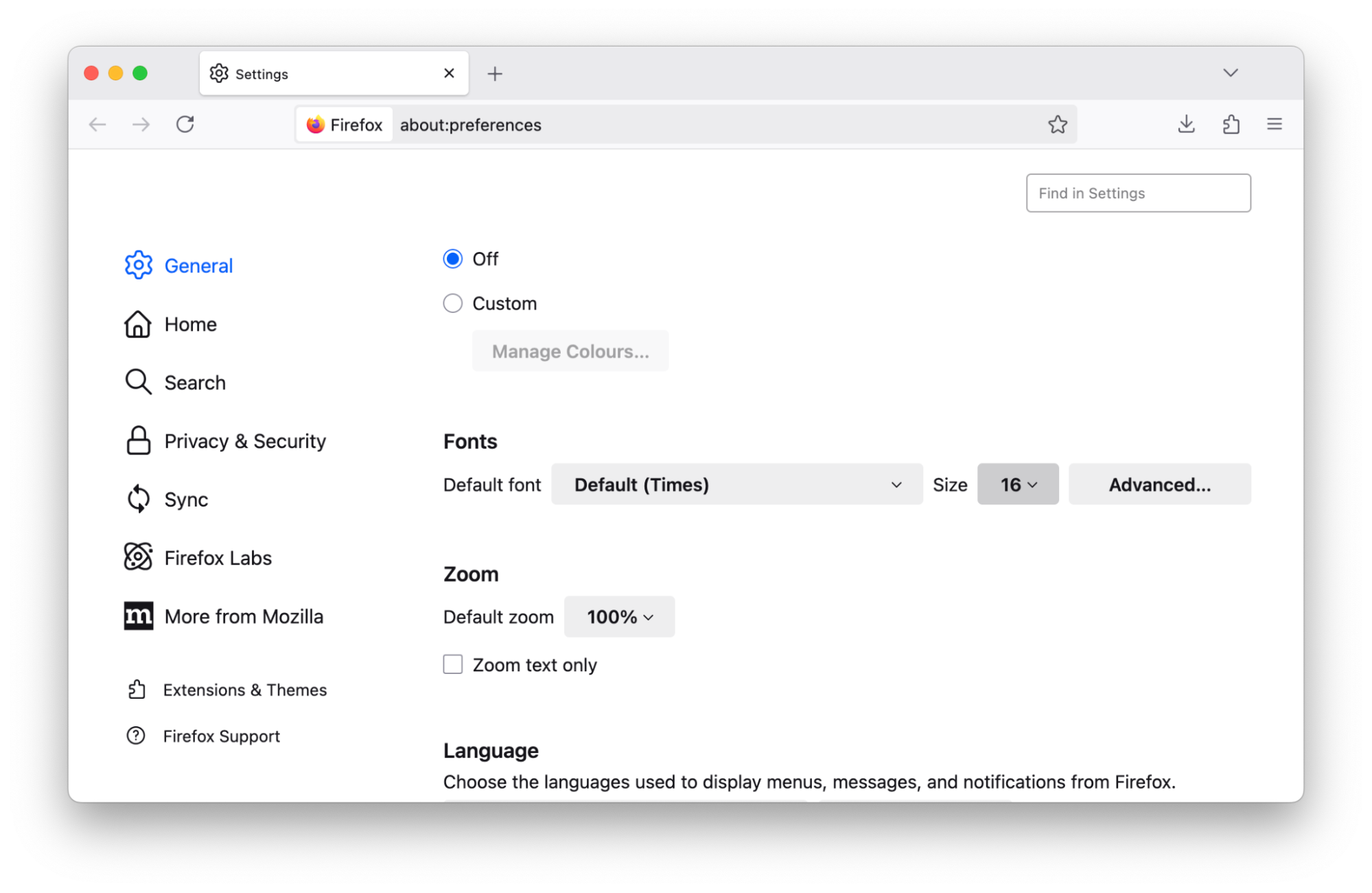
Firefox users can explicitly set a default font size in pixels, or enable ‘zoom text only’. Both will affect the UA’s initial font-size.
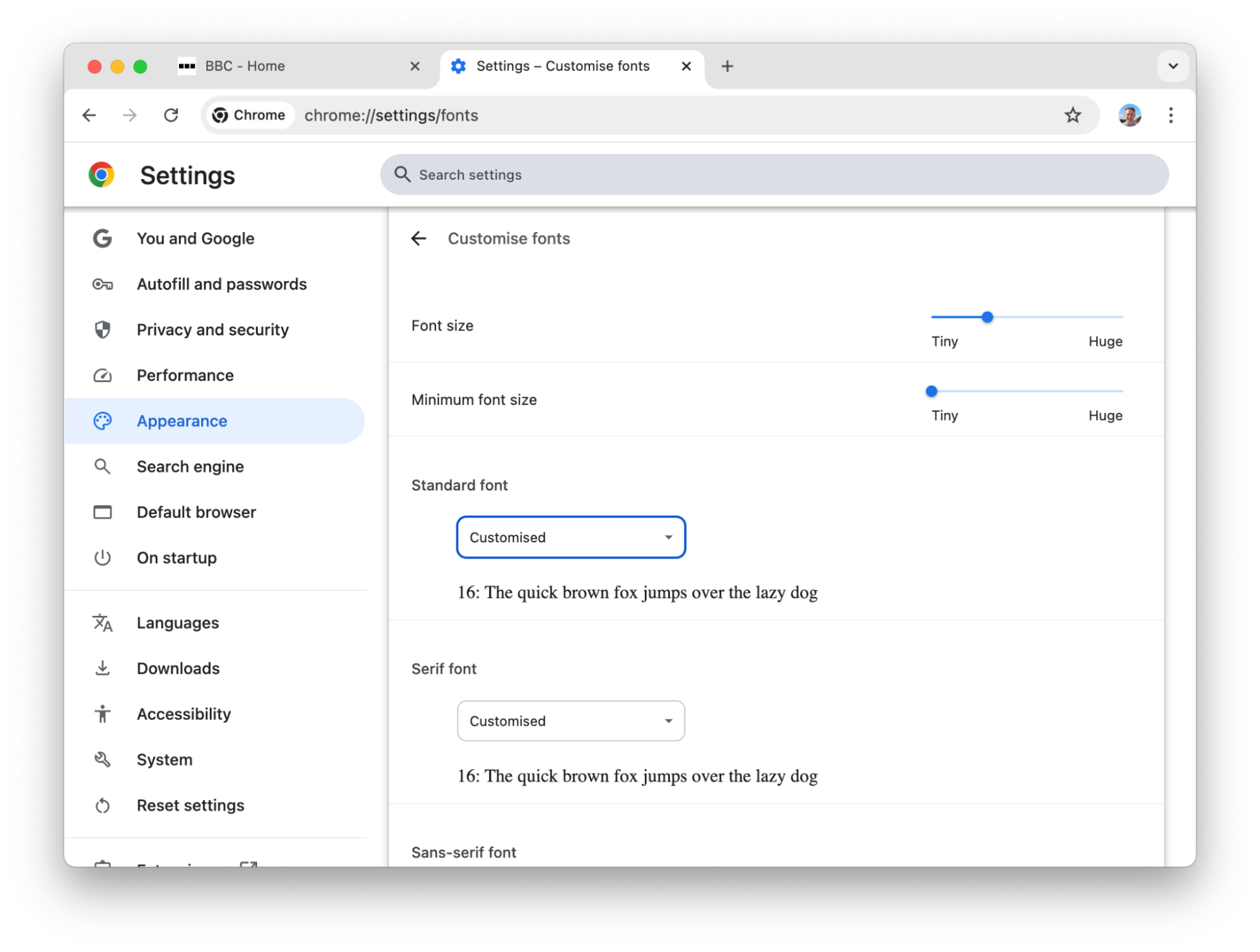
Chrome and Edge users can explicitly set a default font size in pixels. Doing so will affect the UA’s initial font-size.
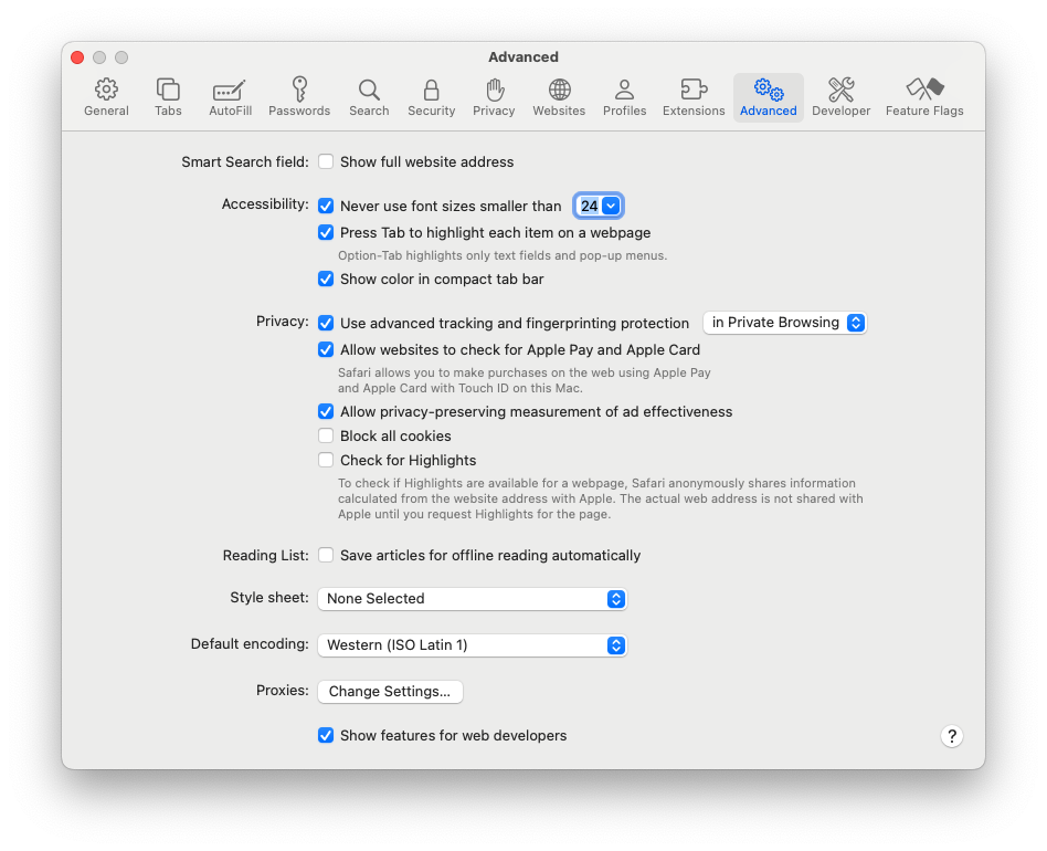
Safari users can change the initial font-size per-domain by holding down the Opt key on the keyboard. When doing so, the ‘Zoom In’ and ‘Zoom Out’ menu items change to ‘Make Text Bigger’ or ‘Make Text Smaller’.
Safari also has a minimum font size setting:
Currently, the most popular mobile browsers do not provide controls to change the UA initial font-size.
Today, mobile OS-level font settings typically have no effect on a web page. On desktop OSs, the effect varies.
Unlike the UA font scale setting, the initial font-size value medium does not change when the OS-level font setting is set to a non-default value – it’s still 16px.
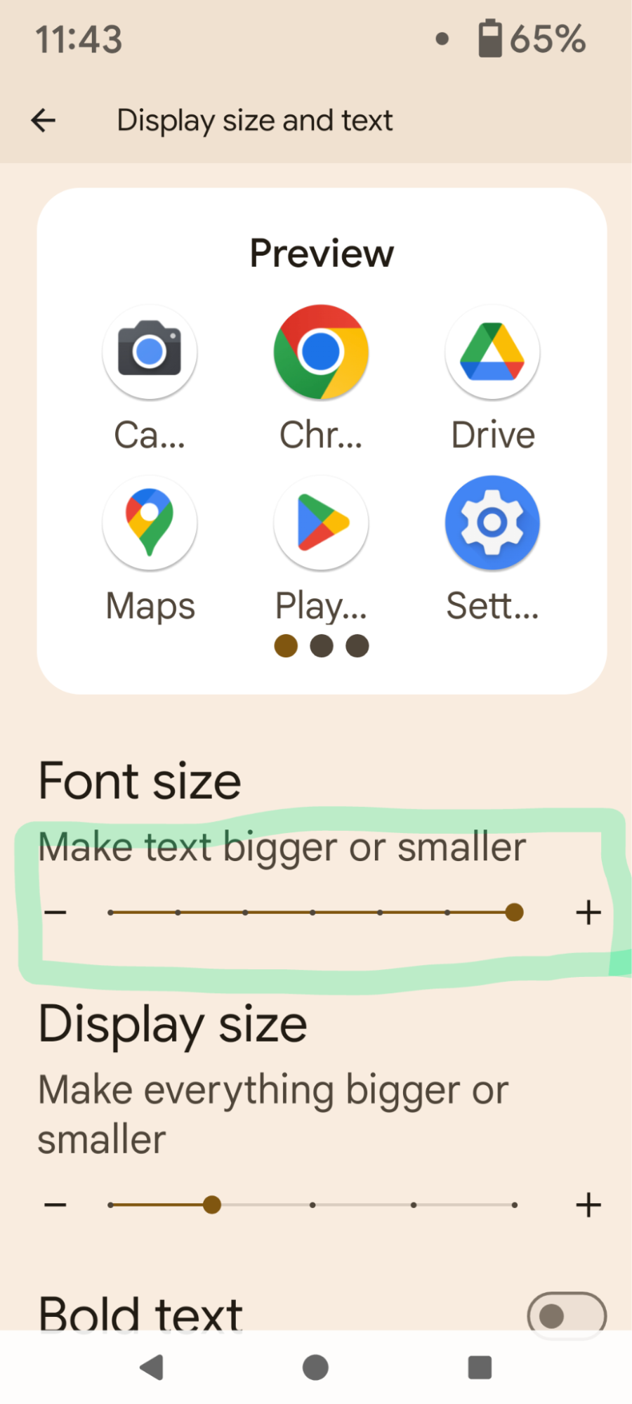
|
OS font slider set to Default |
Set OS font slider to max |
URL bar and icons are magnified, but the page is unchanged |
|
|
|
|
When text is scaled with text-size-adjust: auto, the inflation algorithm is not affected by the OS-level font setting:
|
WebKit text autosizer at default OS-level font |
Set OS font slider to max |
WebKit text autosizer at max OS-level font |
|
|
|
|
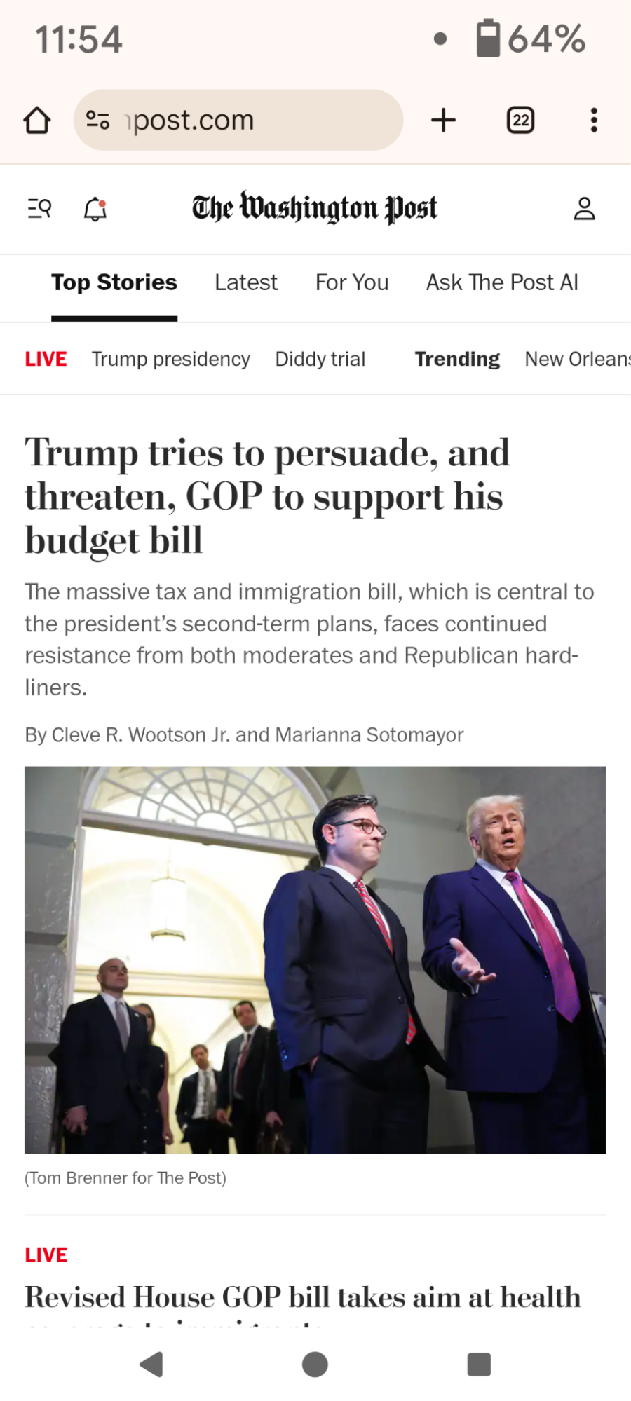
The majority of sites are not affected by the OS-level font slider. For example, WaPo:
|
Blink text autosizer at default OS-level font size |
Set OS font slider to max |
Blink text autosizer at max OS-level font size – no change. |
|
|
|
|
However, for the few sites where Blink’s text autosizer (bookmark) scales text (with text-size-adjust: auto), the inflation algorithm does use the OS-level font setting, as can be seen in this contrived example:
|
Blink text autosizer at default OS-level font size |
Set OS font slider to max |
Blink text autosizer at max OS-level font size |
|
|
|
|
Not many native macOS apps seem to scale.
Chrome, Edge and Firefox all do a full browser zoom of both the browser’s UI and the web page.
|
Edge at 200% text size |
Chrome at 200% text size |
Firefox at 200% text size |
|
|
|
|
Notice how large the tab strip is in all 3 Desktop browsers compared to the Windows taskbar
There is currently no standardised way to detect or respond to the OS-level font setting. Authors often ask how to do it.[3] This is the shortcoming this proposal aims to address.
Using a client-side script, it is possible for an author to measure a run of text that has been scaled using text-size-adjust. That is the strategy described by this very long stackoverflow answer that only works on pages in WebView. It won’t even detect OS-level font settings on the open web. This StackOverflow answer illustrates what authors are willing to go through to get this value, even for WebView only.
google.com performs a variant of this reverse-engineering strategy, but on the open web. It involves displaying the word “Google” 40x offscreen and measuring the resulting bounding box.
WebKit supports proprietary vendor-prefixed font keywords. They can only be used in the font shorthand property, so they also override font-family, font-weight, etc. Authors can include the following in their stylesheet.
:root {
font: -apple-system-body;
}
body {
font-family: sans-serif;
font-style: initial;
font-weight: initial;
}
When the OS-level font settings are set to the default, the font-size returned by -apple-system-body is different to the de facto 16px initial font-size. (It is a likely reason why this non-standard approach is not used widely.)
google.com also reverse engineers the OS-level font setting on iOS devices by using -apple-system-body and measuring the text’s resulting bounding box.
|
Note: You can observe the properties by opening this web page on Safari: iOS System Fonts Test. Observe how the ‘a’ ‘A’ zoom buttons on Safari on iOS change these fonts at different proportions, as specified in the Apple Human Interface Guidelines. |
We propose a new CSS environment variable, provisionally named env(preferred-text-scale), that exposes the user’s text scale preference as a unitless scalar. (Draft spec.) In the default scenario where the user has not changed any text scale settings, the value is 1. If the user doubles the text scale, the value is 2. Likewise, if the user halves the text scale, the value is 0.5.
The scalar value is determined by the UA using text scaling settings in the OS and/or the UA.
|
Example 1: On Android where there is no UA-level setting, if the user increased the OS-level ‘font size’ setting as shown below, env(preferred-text-scale) would return 1.3.
➡️ Example 2: On macOS and iOS, if the user increased the ‘text size’ setting from the default 12pt to 20pt, the increase is 66.666…%. Therefore, the UA may set the value of env(preferred-text-scale) to 1.666….
Example 3: Or, if a macOS user set their UA-level font-size from the default 16px to 24px, while leaving their OS-level ‘Text Size’ unchanged, env(preferred-text-scale) would return 1.5.
|
If the user sets the text scaling settings in both the OS and UA, the UA may set the scalar value to be a product of the two.
|
Note: It is rare for any browser to support both UA-level and OS-level font controls. For Chrome, it only happens on Windows. |
On UAs that account for text scale settings by doing a full-application zoom or full-page zoom, the UA should set the value to 1. Otherwise, page content could be scaled twice: by both the UA and the author’s stylesheet.
Pros
Cons
A member of the TAG raised a concern that the proposed environment variable is a fingerprinting risk. Quote:
Letting users pick an arbitrary value that'll be given to all the sites they browse, tends to divide them into buckets that are too identifying. But it might work to define a set number of buckets that give a close-enough approximation to each user's ideal font size.
To mitigate these concerns, Blink has implemented bucketing. Blink’s implementation maps the real-valued preferred scale provided by the OS into a predefined set of 7 discrete buckets.
We acknowledge that bucketing does lead to a subpar user experience on platforms that give more scale options than the number of Blink’s predefined buckets, or whose options don’t align closely with the predefined buckets.
We recommend this as best practice, but it might not be practical to do on an existing complicated page.
:root {
font-size: calc(100% * env(preferred-text-scale));
/*
To prevent double scaling, disable the mobile browser's heuristic-based autosizer:
*/
text-size-adjust: none;
}
Authors can use the text-size-adjust property to selectively boost the font size and line height of certain elements. Note that currently, text-size-adjust only has an effect on mobile browsers, but mobile browsers are where text boosting is more prominently needed.
:root {
text-size-adjust: calc(100% * env(preferred-text-scale));
}
OR
:root {
text-size-adjust: none;
}
.article-body {
text-size-adjust: calc(100% * env(preferred-text-scale));
}
Authors can use env(preferred-text-scale) in media queries and container queries.
.sidebar-layout {
display: grid;
@media (width > calc(600px * env(preferred-text-scale)) {
grid-template-columns: 1fr 18rem;
}
}
|
Note: While font-relative units like rem aren’t affected in media queries, they are in container queries. Therefore, if the root font-size is changed with env(preferred-text-scale), there is no need to reference it in a container query; the author can use rem units. |
If an author didn’t want headings – for example – to scale up at the same rate as body text, they could modify the scalar value provided by env(preferred-text-scale).
By default, Android Webview scales the text size by the system font scale factor. App developers may override this default by invoking setTextZoom().
We recommend that apps embedding pages that use env(preferred-text-scale) override Android Webview’s default scaling with setTextZoom(100). But text-size-adjust doesn’t work in Android Webview yet. See https://crbug.com/419469463
Reddit is one of the few sites on the web where Blink’s text autosizer still has an effect.
reddit.com in scenarios where the user has selected a 2x OS-level font scale
|
reddit today (with Blink’s text autosizing[1]) |
reddit with NO text autosizing[2] |
reddit after applying `text-size-adjust` to BODY [3] |
reddit after applying `text-size-adjust` to comments [4] |
|
|
|
|
|
[1] Notice the text autosizer heuristics non-uniformly scale comment font size.
[2] I.e. with body { text-size-adjust: none; } Comments are probably too small to read for someone who requested 2x font sizes
[3] I.e. with body { text-size-adjust: calc(env(preferred-text-scale) * 100%); } Notice how the blue snoo is cut off. The implication is that authors will unlikely be able to blindly apply this to every element on existing pages; layouts will have to be adjusted or preferred-text-scale will have to be applied selectively.
[4] With .text-14 { text-size-adjust: calc(env(preferred-text-scale) * 100%); } A quick first attempt at selectively applying preferred-text-scale. It is applied just to the comments. Now, all comments are scaled uniformly. This represents an improvement over the other three options. But a similar rule might have to be applied to other parts of the page as well, such as increasing the size of the header, buttons, etc.
Google search currently detects the OS font scale factor
by measuring text and adjusting styles throughout the page. Because they
do not have env(preferred-text-scale), they do this measurement post-load,
store the result, and only apply scaled styles on subsequent page loads.
For complex existing pages, scaling text is not as simple as just applying
a scale factor, as that can result in clipping bugs (see clipped
"dog" search term in middle panel below).
|
Google search, 1.0 OS font scale (live site) |
Google search, all fonts synthetically scaled with * {text-size-adjust: 130%; } |
Google search, 1.3 OS font scale (live site) |
|
|
|
|
The proprietary, non-standard -apple- fonts give specific font sizes for different roles like body text, headings and subheadings.
On the other hand, the env(preferred-text-scale) is a single scale factor/percentage that corresponds to body text. We are letting authors decide how to scale their headings, etc. We may in the future want to provide a family of environment variables or units that more readily map to various text roles.
For Desktop Chrome, you can use the --blink-settings=accessibilityFontScaleFactor=2 command line flag to simulate the OS-level font scale. This will result in the env var returning 2.
E.g. You can enter this in the command line on macOS:
/Applications/Google\ Chrome\ Canary.app/Contents/MacOS/Google\ Chrome\ Canary --blink-settings=accessibilityFontScaleFactor=2.0 --enable-experimental-web-platform-features
--blink-settings=textAutosizingEnabled=true also enables text-size-adjust, which otherwise only has an effect on mobile (or devtools mobile emulation), at least for the time being.
The minimum font size setting is not involved in the derivation of env(preferred-text-scale). The minimum font size will still be honored if a small font size is specified.
<meta name="viewport" content="width=device-width, initial-scale=1.0, text-scale-behavior=initial/scale-ems/none">
https://drafts.csswg.org/css-viewport/
A value of scale-ems would cause the browser to scale rem/em units by the text-scale setting, and would disable any existing UA heuristics (full-page zooming on Windows, text autosizer heuristics on mobile). We foresee this being used on new greenfield pages where the authors are checking their sites at a few text scaling values. With this option, the page would likely not need to use env(preferred-text-scale) at all.
A value of none would disable any existing UA heuristics (full-page zooming on Windows, text autosizer heuristics on mobile). This would be used for existing pages that are opting into scaling via env(preferred-text-scale) on an element-by-element basis.
This is a
followup opportunity that can build on the currently-proposed environment
variable.
font-size: medium would always be affected by the OS-level font scale.
[1] Note: It is not the same as increasing the display pixel density (i.e. the devicePixelRatio).
[2] According to research by Appt. https://appt.org/en/stats/font-size
[3] There are other questions from authors on how to detect the OS-level font scale with no real answers, including: